Friday 27 April 2012

EVALUATION


Q1. In what ways does your media product use, develop or challenge forms and conventions of real media products?

In the planning of our title sequence we looked at and researched the thriller genre and the codes and conventions. We found that some of these conventions are present within the horror genre as they help to build suspense and a tense atmosphere indicative of the thriller genre.
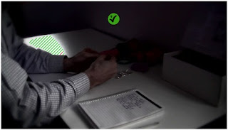
For example the use of artificial lighting helps to create shadows and also distorts the image, which creates a sense of mystery and also enigma codes such as the audience are asking questions like ‘who are they?’ and ‘what are they doing?’ and so we decided to use this for the shots with the killer in our title sequence as we thought that this was quite effective because it builds suspense and maintains the mystery because of lack of the character's identity.

We wanted to include lots of enigma codes within our title sequence, this was influenced by the title sequence for ‘Seven’. By using enigma codes, this make the audience ask questions and so this keeps them is suspense and they are wondering what is going to happen next. However, we didn’t stick to the narrative conventions as we only incorporated the villain from Vladamir’s theory. In our title sequence the villain takes the form of a killer, murdering the vulnerable young girl. Instead of adhering to the convention of Todorov’s theory we decided to begin the narrative with the disruption of equilibrium rather than showing the beginning state where there is equilibrium. We incorporated the conventions of sound by using a heartbeat sound clip. This is often used within the thriller and horror genre because it is a convention that effectively builds tension and suspense.

We also focused on the significance of signifiers and the use of semiotics, this is important within thrillers as it creates enigma codes for the audience as well as giving the suggestions about the narrative. The inspiration for the use of semiotics and connotations appeared more prominent as we looked at the image for ‘Schindlers list’ as it subtly gave suggestions into the narrative. Also the by having the soldiers behind the little girl suggests that the she is surrounded by war and death and so this suggests that she is going to die within the narrative. The use of red also backs up this idea of the sense of danger and death and that she will die.

Q2. How does your media product represent particular social groups?

Within our title sequence we decided to adhere to the character and mise-en-scene conventions by having the killer in dark clothing, this makes his appear more sinister as black has the connotations of death and evil. However, the killer also subverts to the typical representation and conventions of a killer as he is wearing jeans. This suggests that the killer is of working class and not seen as a typical villain within a thriller. This is because the conventions of a thriller include a villain that is an intelligent ‘super villain’ that out thinks the police and so this creates the suspense within the thriller because the audience are left wondering whether the villain will be found out and caught in the end of the narrative.

He is also wearing shoes that would be typically seen as younger person’s shoes. This creates an enigma code as the audience are left wondering about the identity and age of the killer. In the shots where the killer is looking at the items in the box, the killer is wearing a chequered shirt. This reinforces the idea that the killer is of a working class status and so he is not see as a typical ‘super villain’. This appears quite sinister because he is seen to be like any other normal person and so he is not seen as the stereotypical type of killer. In these two different scenes the killer is wearing contrasting types of clothing; this has been done in order to create enigma codes as this could make the audience wonder whether there may be actually two killers.
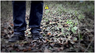
By having two different styles of dress, this could also suggest that the killer has a split personality or maybe a psychological illness and so this could give the audience a psychological depth into the character. The fact that the little girl is wearing a pink coat is significant because most young girls are into pink and girly colours. This suggests her innocence and vulnerability because she is of a young age.

The idea of the little girl being so vulnerable and innocent highlights the fact that the killer is not typically a younger person because children do not normally behave in this way and kill other children and so the audience would may think that it is behaviour of an adult rather than a younger person. However, within thrillers such as ‘The Omen’ and ‘Orphan’ this is not the case. As within ‘The Omen’ the little boy is the devils son and so this subverts the idea of children representing innocence. Also within ‘Orphan’ it appears that the female character is a young girl and so this would appear to subvert this representation of children and then we discover that the character is an older woman.

This means that the film looks at both younger and older aged people and so this could be used to show that children could be as sadistic as adults. As we have used a young girl as the central protagonist within our title sequence, it is stereotypically thought that the killer would be a male character as the audience are aware that in the media there are stories of young girls being kidnapped or murdered by older males. In our title sequence there are a range of social groups that could be represented, especially though the use of mis-en-scene.

 
Q3. What kind of media institution might distribute your media product and why?

As we decided to use the film company ‘Film 4’ for the production of our title sequence, this meant that our film would be a low budget British production and would probably mainly be distributed within the UK. Cinemas are widely popular among the younger audience viewers, but also older viewers can enjoy viewing the film as it is not just available to one social class. However, releasing films onto DVD format has proved to be popular especially amongst our potential target audience this is because the audience are able to watch films in the comfort of their own homes. Media technology has evolved over the years and especially the method of distribution. Selling films online have also proved popular and so the media institution ‘iTunes’ could also distribute our film as it would have been shown in British cinemas and released onto DVD.
Film 4’ is a digital television channel within the UK and the Republic of Ireland. It is owned and operated by Channel 4 and so this means that viewers are provided with a TV channel that distributes British Films, which would meant that we could use this to our advantage to distribute our film. ‘Film 4’ was a subscription only service. However, this was dropped in 2006 and so our target audience would be able to watch our thriller without having to subscribe to the channel and so different social classes may not be excluded. An online film distribution method (‘World Cinema Online’) was set up in order to allow audiences to purchase or rent films that are both award winning independent titles as well as quality titles that haven't had the exposure that they deserve as well as covering a large range of genres, but mainly specialising in lower budget films. This means that ‘Film 4’ would be able to distribute films all over the world, which would mean that we would have a larger target audience.


Q4. Who would be the audience for your media product?

The target audience for our thriller is to a wide audience, as it is a certificate 15, this means that our film appeals to teenagers as well as the older audience because it involves scenes of action as our potential target audience questionnaire showed that these was the top choice. Our thriller is not targeted towards any particular nationality. However, the main nationality of the audience may be British as the production company ‘Film 4’ focuses on British films. This means that the film may be distributed mainly within the UK rather than being a worldwide release and so their films would mainly be for a niche audience. This film would also appeal to an audience that enjoy action, psychological and crime thrillers as there is a build up of suspense and tension. It would also mean that the audience may have a higher education level because thrillers involve the audience thinking about what is going to happen next and how the narrative will unfold.

Q5. How did you attract or address your audience?

During the planning of our title sequence we thought that including conventions of a thriller was the best way to attract and address the audience as this would help to build suspense and to create a tense mood indicative of the thriller genre. The use of tense music such as the heartbeat builds tension because the audience’s heart beat matches that of the non-diegetic sound of the heartbeat.
Within thrillers binary opposition is used as a basis for a narrative as it shows the two oppositions (good vs. evil). Within our thriller we have used a victim and a killer to show this binary opposition. This means that the victim is could suffer an inevitable downfall and so this gives the audience an insight into the narrative. The fact that the audience do not know why the killer is murdering young girls is particularly sinister as you do not fully understand his psychological state and also his motive, of if there is one. This creates and increases the suspense as the audience are kept guessing. We tried to maintain the sense of mystery by concealing the killer’s identity; this creates enigma codes as the audience want to know the killer’s identity and what their motive is. This also relates to the audience as they may have a higher education and so they would need to be quite intellectual in order to keep up with the different twists and turns within the narrative.

It fits the thriller genre as this is a convention of the genre because the narrative is not supposed to be given away at the beginning and so this is basis of creating suspense and tension. We edited our title sequence so that it appeared to more of the thriller genre. For example, we used a three way colour corrector tool to decrease the saturation so that the shadows appeared more prominent and so this distorts areas of the frame and this adds to the sense of mystery. By using close up shots this suggests that the character is scared and suggests the sense of fear. This builds tension and suspense as the audience can see the fear in their eyes as well as their facial expression. By using this convention it makes it indicative to the thriller genre and this is what the audience want to see as they want to tension and suspense to be built up and maintained.

Q6. What have you learnt about technologies from the process of constructing this product?

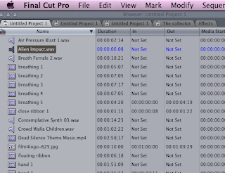
Through the construction of this product I have learnt a lot about how technology is used not only within our own projects but also within the real media world as there are lots of similarities. I have developed my computer skills as we have been using different software on the ‘Macs’ that I had not used before for our project. I have especially become familiar with the programme ‘Final Cut Pro’ and how to edit clips and join them together effectively. Using ‘Final Cut Pro’ and ‘Soundtrack Pro’ allowed us to come up with more creative ideas that improved our title sequence. For example, we really liked the effects used for the text within the ‘Seven’ title sequence and so we experimented with a range of fonts and effects that allowed us to create a font that looked typical of the thriller genre.
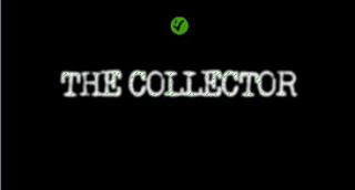
We found a font called ‘Old Typewriter’ on a font website that gave the sinister effect that we were looking for. During the planning of our title sequence we decided that we would have a white and black effect with a red ribbon in the shot. However, after experimenting with some of the other effects such as changing the saturation we thought that this would look better and more thriller like as there is still colour in the shot as well as there being the dark shadows being sat by the trees. We also learnt how to arrange and organise our clips using the timeline.

This meant that we were able to layer the different clips of music that we used within our title sequence and I think that this made our title sequence more effective as there was the sound of the violins, heartbeat, the build up and the music box lullaby. While we were editing I leant how to add cross fades to the clips so that there was a smooth transition from frame to frame, it also helped to slow down the pace of the title sequence, which added suspense and tension indicative of the thriller genre. We used torches to add quite subtle artificial lighting, we also had light coming in through a window and we wanted light on the killers hands so that this makes the audience focuses on what the killer is doing, creating enigma codes, such as whose items are they? And why does he have them? We worked as a group to edit our title sequence and so we all knew how to use the different programmes. Although we did work as a group I think that I would now be more confident of editing if I had to do it independently.

Knowing how the tripod worked was also important as we wanted to shoot a scene using a pan and so it took us a little while to get it just right for filming the shot. One we had it sorted we liked our panning shot as it shows the little girl running through the wood. This clip may not have been as effective because it may have been too shaky without the tripod. We also learnt how to use ‘Motion’, this allowed us to make the ribbon stand out as we could select the colour of the ribbon and change the brightness so that it appeared more dominant within the frame and so that the audience are more aware of the ribbon and so this creates enigma codes such as ‘why is the ribbon so important within the narrative?’

Q7. Looking back at you preliminary task, what do you feel you have learnt in the progression from it to the full product?
Since doing our preliminary task we have learnt a lot as well as being able to develop on skills that we had gained from doing the preliminary task. When we did our preliminary task we found that we had made quite a few mistakes, such as the 180 degree rule and we also made a few continuity errors along the way. I found that the preliminary task was more simple compared to the main task as it was more structured, whereas the main task had to last 2 minutes and we didn't have to include certain shots or techniques. I think that by creating a target audience questionnaire this helped us get different ideas as we knew what our potential target audience liked and wanted from a thriller and so we could base some of our ideas using the feedback from the questionnaire.

As we made quite a few mistakes in the preliminary task it taught us to plan and be a bit more organised rather than just making a storyboard and then filming and so we discussed our ideas and thoughts so that the whole group understood the narrative and shots that we were going to us. This also meant that the group had time to come up with other ideas on how to improve our title sequence so the communication within the group worked really well. The main lesson that the preliminary task taught us was that we needed film more than what we needed. When we tried to edit our clips together we found that they didn't fit together properly the first time and so when we filmed for the main task we filmed each clip for a few seconds longer than what was needed and so we were able to cut it ‘Final Cut Pro’ when we came to editing.

Also filming things multiple times proved helpful as not everything worked best first time and so we recorded things from different angles so that we could see what worked best when we came to edit. The lighting and shadows in location for our preliminary task taught us that we should take chances and be creative by experimenting with different shots and so we did this while filming as we re-filmed sections of the title sequence to make sure we had enough footage to work with. Doing the preliminary task mean that we had the basic of how to use ‘Final Cut Pro’, the camera and tripod. It really helped because we knew how to load our clips and put them on the time line to create a rough basis on what our title sequence was going to look like as we had the right order of where they were going to go.

Even though we had the continuity error of the lighting and audio in our preliminary task it made us think more about continuity and how important it was to keep things the same. We also thought about the different types of lighting and camera angles that we as camera shots such as close ups and artificial lighting are conventions and are indicative of the thriller genre. In the preliminary task we didn't have to do any research and I think that if we didn't do this then we wouldn’t have come up with the different ideas that we did. For example, we may not have had the box scene with the killer if we hadn’t of watched and analysed the title sequence for ‘Seven’ or the effects of the titles. The research that we conducted, allowed us to look at the different conventions that are indicative of the thriller genre and that help to build tension and suspense.


BRITISH BOARD OF FILM CLASSIFICATION


The BBFC (British Board of Film Classification) uses specific guidelines to classify films and games on age by giving it an age certificate on their content. Topics such as language, discrimination sex, violence and drugs in films and games are taken into consideration. Our thriller displays horror crime and violence and so this would affect the age certificate and so this is one of the reasons behind the age certification behind our thriller and also the age range of our potential target audience. Films that include horror or frightening scenes may not be suitable for younger viewers as the classification depends on the length, detail and how regular the frightening sections are as well as effects that are used such as music and sound and if the outcome shortly follows the scene, whereas, older audience viewers often enjoy the tense and chilling thrillers and so the classification method has been put into place in order to protect the younger audience viewers.

Criminal and violent behaviour and the easy access to weapons as well as the portrayal of anti-social and dangerous behaviour affect the age certificate as dangerous behaviour such as self harm is quite a violent and delicate topic and younger viewers may think this acceptable and so they may copy the behaviour. By having the certificate as ‘15’, this means that the target audience would be more mature and there is not as much of a risk of younger viewers copying this behaviour. Violence features in lots of thrillers as both younger and older see violence as form of entertainment and so younger viewers may think that it is acceptable to copy this behaviour. If there is a high level of violence then the classified age will be higher.  

I think that rating our thriller as a ‘15’ means that we will have a larger range audience compared to if we had of had a certificate of ‘12’. This would have not of made our thriller as effective because we wouldn’t have been able to build up the tension and have as many menacing scenes. Having a '15' certificate means that only a certain amount of violence, criminal behaviour and horror can be shown in our thriller and so we woudl still be protecting the younger aged viewers as well as having some chilling scenes which is what the target audience want to see. 


Wednesday 11 April 2012

PRELIMINARY TASK

For our preliminary task we had to film a scene where a person walks through a door and sits down and holds a short conversation with another person. We began planning our task by thinking about the narrative within our scene. As we had to use over the shoulder shots as well as shot reverse shot and the use of the 180 degree rule, we wanted a conversation where the audience can see the characters react to the conversation. After coming up with conversation we created a storyboard so that we could plan and see how our scene was going to fit together as well as reminding us of what we had to do if we had to go back and record.


The first time we went out to film we chose to use a door that lead to outside. We wanted to use different locations to make it different and more interesting. However, while we were editing our clips together we encountered a few problems. While we were filming loud music began playing in the atrium and so you weren’t able to hear the dialogue properly and so the audience wouldn’t be able to hear what was going on. Also we found that the distance from the door to where Morgan was sitting was too long and so we had a long shot duration, we tried to film this by using a panning shot but were unable to as it we either had a close up shot of Ashleigh walking or her head went out of the frame.


This meant that our clips didn't fit together as well as we had of hoped, the match on action also didn't flow properly and it appeared to keep jumping with the shot changes. The next lesson we rethought about our choice of location, we wanted to continue with the idea of starting outside and walking inside. We thought that the front of the college was an ideal location for the filming of our task. After filming our clips we edited our task in ‘Final Cut Pro’. We found that our clips fitted together better this time and our match on action worked better. However, after we finished our preliminary task and watched it back we realised that we had broken the 180 degree rule.


This disorientates the audience and should be avoided when filming a conversation or a scene involving two people. When we did the over the shoulder shot we found that we could have moved the camera so that we had more of the person’s shoulder in the shot as there was slightly too much room of the other side of the frame. However, we liked that the audience were able to clearly see the character’s reaction and facial expressions. The problem with filming from the outside and them filming inside is that the light and sound didn't match that inside the building as there was less light outside and then there was lots of light as you walked into the building.


Outside there was not much noise and it was quite quiet and so as we filmed inside the building you could hear people talking and so there was an audio continuity error. Along with the change in lighting this would disorientate the audience and may become confused as they may think that it is a change in scene. However, we thought that where we filmed the lighting was quite effective as there was a sufficient amount of light and so there was a lot of interesting shadows which made the scene look quite effective.


In doing this preliminary task we have learnt about how to use techniques such as shot reverse shot, over the shoulder shot, match on action and also the 180 degree rule, even if they didn't work out as well as we had hoped. We have also how to use the basic editing techniques on ‘Final Cut Pro’ as well as learning about how to use different shot movements and angles. This will help us within the production of our thriller title sequence as we will understand the basics of the media technology we will be using.


Saturday 7 April 2012

TITLES

After coming up with the narrative on the film we had to think of a title for our thriller. We wanted something that related to the film but didn't give too much away and so we thought of ‘The Collector’ as it sounds quite sinister and it creates an enigma code because the audience are wondering what he collects. This would engage the audience as they are left thinking about what is going to happen next. The reason for us choosing this title was because the killer collects objects such as a teddy or a bracelet from the young girls that he kill.


During the planning of our title sequence we looked at other students’ work from the previous year. This allowed us to see what a media production could look like and some of the effects that we could use within our own title sequence. The main idea that we got from one of the title sequences was having a definition within the title sequence. The definition implies the killer’s obsessive behaviour and so some of the narrative is revealed because you are able to understand his psychological state. This would make it fit into the genre of a psychological thriller.

RISK ASSESSMENT

During the planning of our title sequence we considered having a weapon such as a knife to suggest that a murder had occurred. However, we came to a decision that not having a knife would be better as we didn't want to give the narrative away. It also meant that it wouldn’t be seen as more of a horror, comedy thriller or gory thriller. Depending on how we filmed the scenes, this meant that our title sequence could have fell into one of these genres and so would not have made our title sequence as effective because the tension may not have been built up so much due to the knife being in shot.
 
 
After deciding that we weren’t going to use a weapon in our title sequence the only main concern was the location as we wanted the central protagonist to be running through the woods and so we had to plan our filming so that we chose a day where we knew it want going to rain as this would have made the ground all muddy and so it wouldn’t have been safe for the little girl to go running in. When we arrived at the location where we were going to film we also had to move some large branches and logs that were in the way. This was mainly because we didn't want anyone falling over or tripping on the logs. As we filmed most of our title sequence in the middle of December, it meant that it was quite cold and so we didn't want to spend lots of time outside and so planning before we filmed was the best way to avoid this.

CROSS FADES

After watching our clips and decided that we wanted change the clips to a slower speed we chose to use cross fades for the transitions. This allowed us to maintain the slow pace throughout our title sequence. We did this in order to continue the flow of suspense as well as making it indicative of the thriller genre by creating a tense mood, which would leave the audience wondering what is going to happen next. The use of cross fades also builds suspense as the scene is slowly being revealed to the audience.

Friday 30 March 2012

SPEED CHANGE

As our title sequence was not quite long enough we decided to extend the lengths of our clips by editing them using a speed change. By doing this we changed the speed of the shots so that they appeared in slow motion. We really liked the outcome of this edit because it built tension because the audience are waiting to find out what is going to happen. Also the audience aren’t able to match their breathing with the shot changes because the duration of the shots are quite long. The long duration also allows you to see the character’s reaction of fear, we did this to create and build tension as well as creating a tense mood indicative of a thriller genre.

Thursday 29 March 2012

NON-DIEGETIC MUSIC AND SOUND EFFECTS


For our initial ideas we considered having the nursery rhyme ‘Georgie Porgie’ as we thought that the lyrics (“Kissed the girls and made them cry, when the boys come out to play Georgie Porgie ran away”) fitted the narrative quite well as it suggests the killer’s obsession with the young girls and that he disappears after he kills them. So we managed to get the soundtrack from ‘Youtube’ and imported it into ‘Soundtrack Pro’ where we altered the speed and pitch, which distorted the sound of the voices as the original soundtrack didn't sound right and fit the scene. We added this sound clip to our title sequence and copied and pasted it so that it ran for the whole length of the title sequence.

However, after watching our title sequence a number of times we decided that the nursery rhyme didn't quite fit and also didn't sound very sinister and so we came up with the idea of using a music box lullaby. We looked at different lullabies on ‘Youtube’ and found one that we really liked. We then used the same process as before to make our soundtrack sound contrapuntal and more sinister. We wanted to develop on our non-diegetic music and so we decided to have different layers of non-diegetic music and sound effects. We used ‘Soundtrack Pro’ to search and edit a sound clip so that we could incorporate it in our title sequence. The first sound clip that we used was of a group of violins playing at a low pitch.

This is helps to establish a tense mood indicative of the thriller genre as violins and orchestral music are conventions of a thriller. In order to increase the tension and suspense we used ‘Soundtrack Pro’ again to find a heartbeat sound effect which we copied and pasted so that it ran throughout the duration of the title sequence we wanted to do this in order to get the audience to match their heartbeat with that of the character. In our footage we found that the breathing was not loud enough and that there was too much background noise and so we used ‘Soundtrack Pro’ to get a sound clip of a female breathing so that it could be amplified to make the scene more intense and builds the tension.

We felt that there was a section of sound missing within the title sequence when the little girl is hugging the teddy in front of the tree and so we searched ‘Soundtrack Pro’, where we found a soundtrack that built the tension as it starts of quieter and gets louder and so this also suggests a cliff hanger as the tension is built up so much. We also found that there was another gap in the music where the title was and so we used ‘Youtube’ to search for a sound clip. By doing this we found and used a tiny clip from the theme for the film ‘Dead Silence’. We then edited the clip by cutting the music from the video and cutting the length of the sound clip because we only needed a short section of the music clip.

The short music clip that we used from ‘Dead Silence’ is sinister and so it helps to establish a tense mood indicative of the thriller genre. We were going to use a sound effect of children laughing because it implies the idea of children representing innocence. The idea of the children laughing could either be the innocence of the children laughing or that the children are laughing at the killer, maybe to suggest that the killer will be found out in the end. However, we found that this sound effect did not match the scene and we found that it didn't not create tension or suspense and so we decided to experiment with other ideas.

FILM 4


While we were editing the titles for our title sequence we realised that we hadn’t decided on a film production company and after looking at a number of title sequences we chose ‘Film 4’, which is the production company of ‘The Lovely Bones’. We decided to use ‘Film 4’ because it develops and co-finances lower budget British films. Films by ‘Film 4’ are often shown in the cinema as well as on the TV channel ‘Film 4’. This benefits the target audience as the majority liked watching thrillers within their own home also by showing the films in the cinema it means that they are then released on DVD so then the target audience are able to watch the film at home. We also chose to use the ‘UK Film Council’ as it develops and promoted the film industry and British films and so this would go with the production company ‘Film 4’ as they both focus on British films.

Wednesday 28 March 2012

SCHINDLER'S LIST


We have used the image from the film ‘Schindler’s List’ as we really liked the use of the black and white effect with a hint of red. Although we did not use this idea within our title sequence, this featured a big part in our planning as we discussed ways in which we could incorporate this idea and so we came up with having the ribbon in red  so that it would appear quite prominent and signify death as implied within ‘Schindler’s List’. We really wanted to get the idea of death, blood, lust, violence and evil across as these are the main themes within our title sequence. By changing the saturation levels, there are more shadows dark areas and so this would suggest that evil is all around the little girl and that she is in danger because the red ribbon in her hair would help to suggest this. As we have used a little girl as the central protagonist this emphasises that evil is doing to destroy innocence. Contemporary viewers may see this as a stereotypical murder or crime case as it is often see within modern society that young girls are the victim of crimes committed by older men. This may because young girls are deemed to be more vulnerable because of this belief and so this could make the audience think that the film focuses on the more stereotypical murder involving a young child.

3 WAY COLOUR CORRECTOR

As we filmed our clips for our title sequence during the morning it meant that there was lots of light and the shadows were quite subtle. This subverts to the conventions of a thriller as it is uncommon to have a thriller filmed in a brightly lit location as it doesn't go with the scene and the sinister narrative. We thought that by filming during the day we would be able to edit our title sequence using 'Final Cut Pro', this meant that we could change the brightness so that the shadows appeared more prominent and adhered to the conventions of a thriller.


We used the three-way colour corrector in order to change the decrease the saturation so that the scene didn’t look so bright. After experimenting with this effect we found that we liked this better than having the black and white effect with the red ribbon as you still have some of the colours in the shot as well as the less saturated colours. This helps to focus on the subject within the shot as the background has been de-saturated and the subject is still quite bright and so this would make the character or objects stand out and would suggest that these are significant within the narrative.

VIGNETTE EFFECT

After watching the title sequence for 'Seven' we were influenced by the editing and so we decided to incorporate the use of vignettes within our own production because it helps to establish a tense mood indicative of the thriller genre. We have applied the vignette effect to most of the shots within the title sequence as it makes it appear that there are lots of shadows, which is significant within thrillers.


The use of vignettes makes the audience focus on what is happening in the shot as the oval section where the vignette ends is lighter than other sections and so this also makes the audience focus on what is happening in the shot. I think that the vignette effect with the artificial lighting is particularly effective because you have the light of the torch contrasting the harsh shadows and the vignette effect. We have used this idea to adhere to the conventions of thrillers by trying to create lots of shadows in order to distort the shots and create suspense.

Tuesday 27 March 2012

STORYBOARD


After creating our shot description we then made a storyboard which helped us in the filming process. Our storyboard consists of all the shots that we used in our title sequence. We drew the shots in pencil and then used a red pen to colour in the ribbon as it shows the black and white effect with the red ribbon. However, when we began making our title sequence we found that we needed a place to put the titles and the credits and we didn't know where to put them as we didn’t want to make our title sequence look like a trailer. The storyboard helped us to document our ideas and remind us of what our shots were as well as seeing how everything fits together and the process of our filming as well as being able to see where we could put our titles.

SEVEN TITLE SEQUENCE ANALYSIS


The title sequence for ‘Seven’ begins with a close up of a person looking through a book, this immediately creates an enigma as this would make the audience wonder what’s in the book and if what is in the book is significant. It then goes on to continue the sense of mystery by maintaining the use of enigma codes as there are a range of different images of people. This suggests sadistic and obsessive behaviour and also these images could also have been used to shock the audience. A close up shot has been used to show the killer’s sense of anonymity as he is cutting off his fingerprints. This also suggests violent and sinister behaviour. The use of the backlighting behind the book creates a silhouette means that the character’s identity is being concealed and also highlights the facts that he is physically killing people and so his hands are ending people’s lives.

Having a close up shot of the book with the killer highlighting words suggest the idea of the seven deadly sins. A close up shot of a picture with the face scribbled out reinforces the idea of the killer having no identity. The use of red has the connotations of death, lust, blood and danger. These connotations focus around the seven deadly sins, which is what the film is based on. A close up of the man threading a needle suggests that the character is careful and pays attention to all of the details. Another close up shot is of the killer cutting out the word ‘God’ from a dollar note, this continues the idea of God and that what he is doing is God-like. It also concentrates on the seven deadly sins as this is the main theme and significant throughout the narrative. The font used within this title sequence is typical of a thriller as it is white.

The use of white suggests innocence and within the narrative innocence is being diminished. The font also flickers, which appears quite sinister as the text fades in and out. Using short shot durations makes the title sequence more jumpy and also increases the suspense as the audience have to keep up with the different shot changes. The audience may also only capture a glimpse of the different shots and so this builds suspense because the audience may not completely catch all of the quick shots. A vignette effect has been used in order to get the audience to focus on what is happening in the frame as what is happening is significant. It also makes it look more sinister as it appears that there are more shadows, which is typical within a thriller.  The non-diegetic music is quite sinister as it has many sound effects within it.

The recurring creaking sound used in this title sequence is a typical sound found within most thrillers as it creates tension and suspense because the audience are waiting for something to happen. The voices in the non-diegetic music sound inhuman and this is parallel to the killer as he tortures and kills people, which suggest inhuman behaviour. The sound of the scratches implies a sense of violence and so this would also link with the killer’s sinister behaviour. The artificial light used in the title sequence is quite intense and so this would create harsh shadows and would distort some of the shots to create a sense of mystery and to maintain suspense.


This title sequence was the most influential out of all of the thrillers that we have analysed. We really liked the idea of the book and the photos to signify that he is proud of what he has done and so we wanted to develop on this idea by using items and a box. We also liked the font and have tried to create a font with a similar style, font and transitions, we decided to this because it help to establish a tense mood indicative of the thriller genre.

Monday 26 March 2012

OVERCOMING PROBLEMS

While filming and editing our title sequence we experienced a number of problems, which we managed to overcome. Our first problem was that we had trouble filming the tracking shot for our title sequence as the little girl was being cut off at the bottom and the camera was quite shaky and so we re-filmed this shot a few times, each time with a different person filming and so we managed to achieve a tracking shot after a few attempts. We found that the non-diegetic music of 'Georgie Porgie' in our title sequence was quite simple and didn’t fit the title sequence as well as we hoped and so we discussed different ideas for the music and we agreed that a music box lullaby would work well as it is contrapuntal to the scene and it also adds to the idea of innocence.

We used 'Soundtrack Pro' in order to find some music to go underneath the music box lullaby and layer the music. It took us a while to find some music but we managed to get a soundtrack with violins playing long notes at a low pitch. We also managed to get some intense music which builds up towards the end. The other problem we had was that we couldn't decide where to put our titles, we thought about putting our titles at the end or at the beginning but we wanted to avoid our title sequence looking like a film trailer. We also had a slight problem in thinking of a production company that we could use for our title sequence. After watching the opening title sequence for 'The Lovely Bones' we decided that we were going to use 'Film 4' in our title sequence.

In the title sequence for ‘Seven’ the titles jump and move about and so when we tried to do this ourselves we found that the text moved about too much and so we thought that this would be too distracting. The main problem that we faced when creating our title sequence was that our title sequence wasn't long enough and so we had to come up with a way to make it longer. We overcame this problem by slowing the speed of some of the clips so that the pace of edit and duration of shot was longer. We also knew we needed to add some more clips as our title sequence was nowhere near as long enough. By filming the shots of the killer it allowed us to put the credits on and also gave us an idea of where to put the title, which was towards the end of the title sequence.

FONTS AND SEVEN TITLE SEQUENCE


The title sequence for 'Seven' influenced our title sequence as we thought that the font in 'Seven' was a typical font found within thrillers. We really liked how the how the font wasn't neat and looked quite sinister. We were unable to find a font on Final Cut Pro that would give this effect and so we looked on the internet and found a website that gave a range of different fonts. After looking through the list we really liked the font ‘Old Typewriter’ as we thought that this was a clear font that suggests calculated behaviour as typewriters can imply that attention is being taken as a typewriter, because once you have typed then it can’t be undone. This contrasts the idea of the killer’s behaviour as he have any remorse. We also applied a Gaussian blur to the font as it suggests mysterious and more menacing behaviour. By applying quick fades in and out this makes it look more like a typical thriller genre as it looks sinister and eerie.

Sunday 25 March 2012

SEVEN TITLE SEQUENCE

The title sequence for ‘Seven’ was influential for our title sequence as we really liked how the killer had something to remind him of the victims that he killed. As the name of our thriller is called ‘The Collector’ it gave us the idea to incorporate these items into our title sequence and to give suggestions into the film as well as creating enigma codes. This shows the obsessive and sadistic behaviour of the killer throughout the title sequence.


We also found the titles and credits interesting as they are clear and easy to read. It has a blurred effect on it and so this gives it a more sinister and mysterious effect. It also doesn’t look neat or too bold as it flickers on the screen. The use of a flickered effect is interesting as it makes it stand out so that you see it however; it doesn’t flicker too much so that it takes it away from the scene. It is also interesting how the text moves around the frame and changes in size. These effects make the text appear jumpy and sinister.

LIGHTING

 
For our title sequence we discussed a range of lighting effects that we could use. We decided that because we were filming in the woods it would be hard to use artificial lighting outside and so we would be able to film using natural lighting and then edit the clips using ‘Final Cut Pro’ and ‘Motion’. For the clips where the audience see the killer looking through the box, we have used the natural light from the window and also artificial light by shining torches from a high angle onto the scene.
This meant that you had enough light to see what is going but also the use of artificial lighting create more shadows which appeared more prominent. The use of natural lighting made the scene more realistic and tense as the audience are not expecting anything to happen as natural lighting is not typical of the thriller genre and so would make them think that it could happen at any point in real life.

FILMING

After planning our title sequence we arranged a day to film our title sequence. We began filming in the morning so that there was enough light but also this meant that there were lots of shadows and it wasnt too bright. We started by shooting the section in the field, with the tracking shot. We then moved to an area in the woods so that we could film the rest of the scenes. During the day we filmed a range of different shots so  that we had enough when it came to editing the clips together and producing our title sequence.

After editing some of our title sequence we found that it wasnt long enough and so we had to think of an idea on how to create our titles and credits. After looking at the title sequence for ‘Seven’ we came up with the idea of having the killer look at items in a box. We shot this scene in our media class room as we needed to use a table to boot the box and items on. By using the classroom it meant that there would be enough light as there was a large window next to the table. We filmed this shot on an angle and used a close up shot so that you couldnt see much of the room and so you focused on what was happening.

SHOT DESCRIPTION


This was our first shot description before we began our filming for our title sequence. During the filming process we changed some of the shots and made variations and come up with new ideas which we incorperated in our title sequence. I think that this has improved our title sequence as we formed the basis of our ideas in this shot description and then we went back and discussed some of the shots that we were going to use.

LOCATION SHOTS


When we were planning we discussed a range of locations and we decided that we wanted to film the first section of our title sequence on a field in order to show the little girl’s isolation. This would build tension because there is no one around her and then you see the killer. We wanted to show this using a tracking shot, where the camera moved round the girl so that you could see her in the big field.


The film ‘The Omen’ inspired us because we really liked the idea of having a young child in the forest and so we have used this location in our title sequence. When we filmed our title sequence we didn't have a bin in the shot however, if we had of done it would have suggested that it is a place where people would walk and that there would be people about and that the little girl may not be as isolated as she thinks. The trees cast lots of shadows and this is effective especially as we are filming a thriller title sequence as it appears a lot more sinister and suggests that danger is out there and that the killer could be hiding behind any one of the trees.

POTENTIAL TARGET AUDIENCE

For our potential target audience we thought that our thriller would appeal more to a target audience with a range age from 15 to early 20’s. This potential target audience is based on the fact that there would be some disturbing scenes that would not be suitable for younger viewers. However, our thriller may also appeal to an audience over an older age as it a psychological thriller with the themes of death. Our title sequence focuses on the disappearances and deaths of young girls and so the target audience may find this interesting as you are able to see and understand the psychological depth of the killer within the narrative.

JUNO AND SAVING PRIVATE RYAN ANALYSIS POWERPOINT


After watching and analysing the title sequence for ‘Saving Private Ryan’ I found that lighting could create different moods and can be effective when used to contrast or match the scene. The use of natural lighting is not commonly used in thrillers, especially in a scene where tension is being built up. While planning, we discussed filming our title sequence early in the morning as it would be quite misty. However, we thought that filming during the day would be just as effective as there would be lots of shadows from the trees. The use of a slow pace of edit also makes the scene quite eerie and so we wanted to incorporate this idea into our title sequence and so we thought of using long shot durations to do this.